Street Spots
Connecting skaters to friends, spots & resources to fuel their passion.
Competitive Analysis
Personas
Flow Diagrams
Wireframes
High-Fidelity UI
Accessibility Evaluation
Where
Minneapolis, MN
What
Native Mobile
Why
Portfolio Project
Role
Designer, Researcher
Category
E-Commerce, Sports Industry
When
June - July, 2023
Competitive Analysis
There are a few skate spot apps out there, but these three have the most users/buy-in. However, in the grand scheme, there isn’t a very large user base. None of the apps seem to be growing at a rate reflective of the industry’s growth
ShredSpots
Loke
Smap
The Good
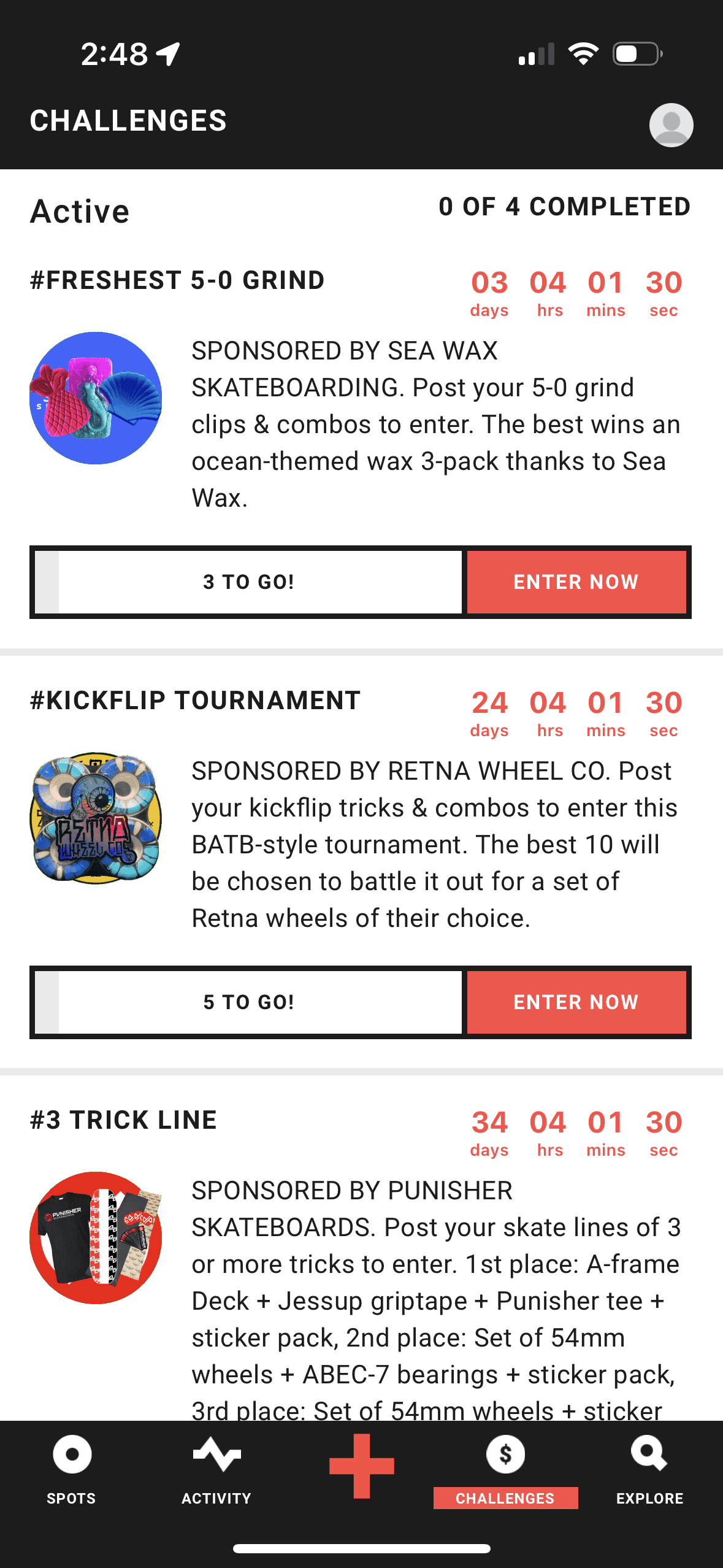
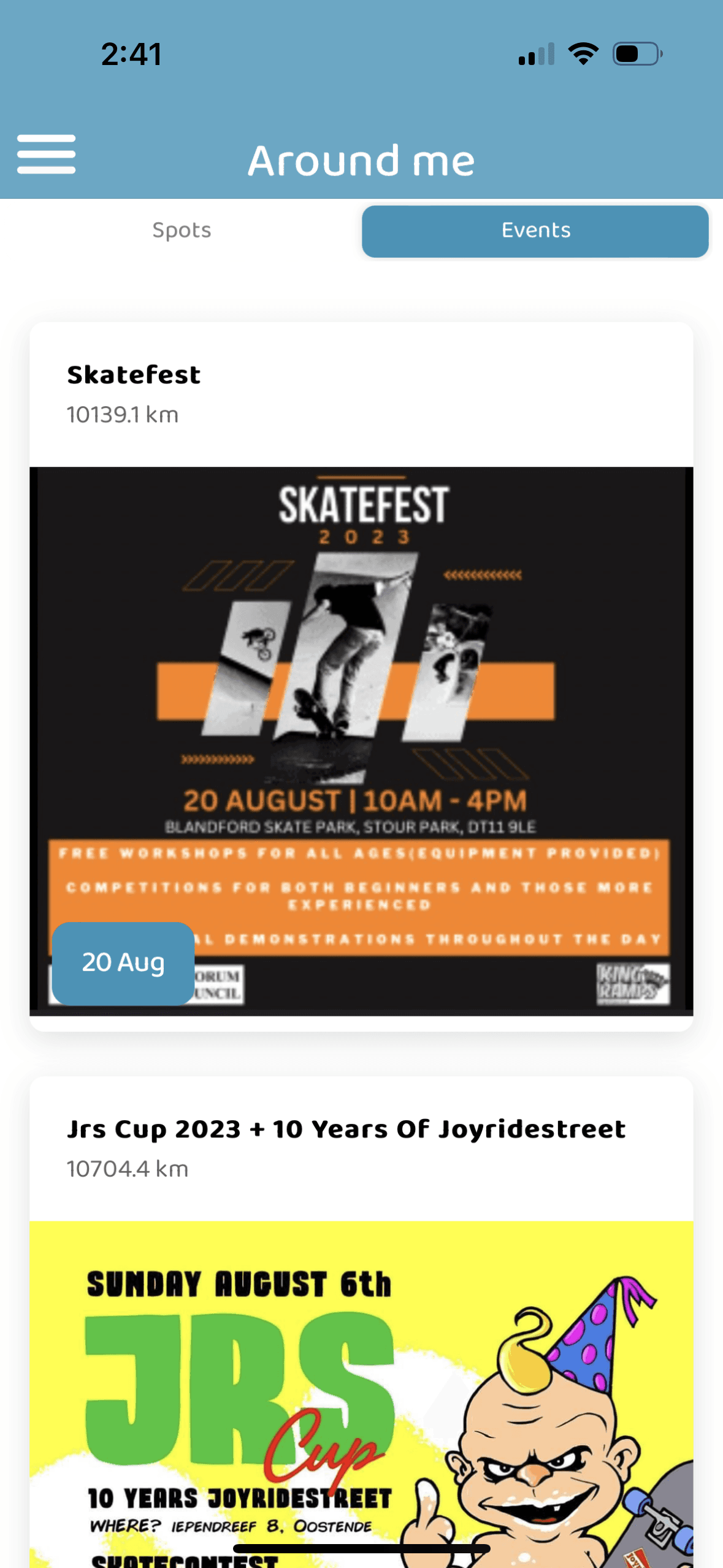
All apps allow for adding of new spots with some customization, two offer event postings, and one (LOKE) offers “challenges” as a source of community engagement.
The Bad
Outdated & buggy UI that can be confusing to navigate. None offer tutorials. User engagement is sporadic.


Initial Research Shows
Currently offered apps
Consistently buggy - most notably, GPS crashing
Offer limited functionality - ex. searching via/inputting an address when adding new spot
Minimal incentive to use app regularly - could solve with more brand investment/tutorials/events
Therefore, my aim was to focus on solving for these three issues when designing StreetSpots
User Personas
I created two unique personas to demonstrate the diverse potential for Street Spots.


Pain Points
Edgar and Jimmy are at different points in their skateboarding journeys. Jimmy is at a point where his talent is high enough to obtain a sponsorship. Edgar is at a more foundational level - looking to improve on his fundamentals and find more spots with friends.
Therefore, Edgar is dealing with all of the issues at hand. He could use an app that provides him a way to find spots and connect with skaters, while also learning more about his craft. Jimmy, on the other hand, could use an outlet where he can get noticed by some brands who may be able to sponsor him.
Time to Start Designing
Once I went through all of my research data, here's how I determined to solve for the problems at hand:
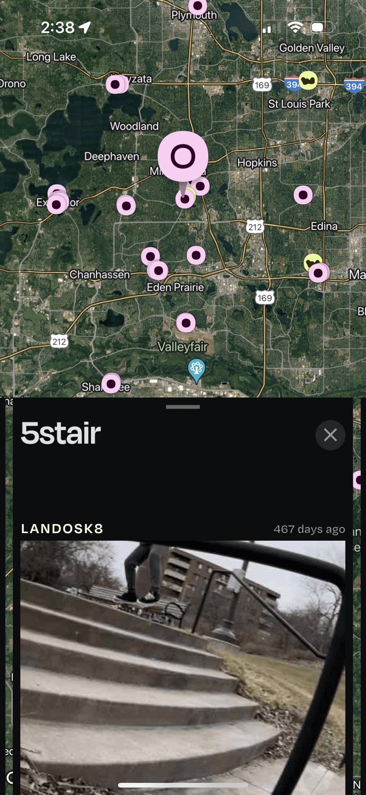
Utilize Google Maps to offer better functionality in GPS
Provide a feature that allowed for users to input address when searching for spots & when adding new spots.
Partner with major brands and skaters by adding shop tab and tutorials features
From there, it was time to sketch out the first flows and initial low-fidelity wireframes.
Flow Diagram
To outline all the necessary functionality I created a simple flow diagram of the main tasks the user can do. One of the flows is shown below. Fail state flows were also created, but are not shown due to space constraints.
Main Client Flow

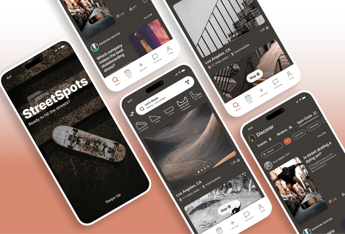
Low-Fidelity Wireframes
Once the flow diagram was established I started creating the low fidelity wireframes of the main flows.
High Fidelity Mockups
With the initial flows considered, I began working on some of the main app screens - firstly, choosing a color palette and font.
Color Palette
Accent, primary, secondary, tertiary, background
Minimalist Look & Feel
This style was achieved by simple icons and small accents throughout
Font
Inter - Regular, Medium, Semi-Bold, Bold, CAP
AaBbCcDdEeFfGgHh

39 High Fidelity Designs Were Created
Including a number of the main screens in a light mode.

Considering our friends…
Jimmy and Edgar had issues that the other apps were not suitably solving for. Therefore, the designs & user flows shown thus far demonstrate features added to try and help our friends:
More brand/professional partnerships in the way of a shop tab, events featured, and tutorials provide an outlet for both of our friends - for Jimmy to be noticed and potentially gain sponsorship, and for Edgar to learn through tutorials given by pro skaters.
Google Maps integrated for reliability & less crashes as well as the ability to search for spots & add new ones via a specific address help our friend Edgar find reliable spots when he's in neighborhoods with which he's not familiar.
Some other notable features, which I believe would be more useful due to a greater incentive to use the app, are those pertaining to connecting with other skaters and sharing videos/pictures/chatting.
I found inspiration in apps like Airbnb, Instagram & Flo as they all provide excellent user experience, simple interfaces and promote user engagement well with their content.
Alignment and Grid
8 point grid
4, 8, 12 & 24 point margins (within groups)
8, 12, 16, 24, & 32 point margins (between groups)
High Fidelity Prototype
I connected the high fidelity designs into a clickable prototype. This would allow for initial user testing.

Accessibility Check
The app has been evaluated for contrast to match the AA standards of WCAG. In some cases I found that the contrast can be improved.
One specific example is the NavBar “Active” status. The original orange color just barely failed AA small text standards. So, although it was a minimal, it was necessary to change this. With the new NavBar orange, it has passed both standards.


Project Summary
During the project, I managed to evaluate the market, create a set of low fidelity wireframes, connect them into a prototype and build them out to high fidelity, beautiful UI designs. In the last checkup round I also did an extensive QA audit focusing on consistency and color contrast with regards to accessibility.
Most notably, with this first iteration I was able to consider the problems that some users were facing with the current apps offered, and solve for these problems with features added into StreetSpots.
